


Understanding annual reports vs integrated reports
Annual reports have traditionally been focused on financial statements, providing a detailed overview of a company’s financial performance over the past year. They are typically compliance-driven documents aimed at shareholders and investors, containing balance sheets, income statements and other financial disclosures required by regulatory bodies.
In contrast, integrated reports take a broader approach, incorporating financial and non-financial elements to illustrate how an organisation creates value over the short, medium, and long term. Integrated reporting connects financial data with sustainability, governance, and social impact considerations, offering a holistic view of a company’s performance and strategic direction.
Given the increasing importance of environmental, social, and governance (ESG) factors, integrated reports must be significantly more engaging than traditional annual reports. While annual reports are primarily factual and financial, integrated reports require dynamic design elements, storytelling techniques and interactive features to capture stakeholder interest and communicate complex interdependencies effectively.
Integrated reporting has undergone a significant transformation since its inception, evolving from a financial compliance exercise to a strategic storytelling tool that communicates an organisation’s broader impact. While content remains crucial, design has emerged as an essential element in enhancing engagement, comprehension, and the overall effectiveness of these reports.
This article explores the evolution of design in integrated reporting, highlighting its growing importance in an increasingly digital and visually driven world ➡️
The shift from compliance to engagement
Traditionally corporate reporting was a compliance-driven activity, heavily focused on financial statements, governance disclosures and regulatory requirements. Reports were often dense, text-heavy, and designed primarily for investors and analysts. However, the introduction of the International Integrated Reporting Council’s (IIRC) framework marked a shift towards a more holistic approach, emphasising how organisations create value over time across multiple capitals.
This shift demanded a more engaging and accessible format and layout, leading to an increased focus on design elements such as layout, typography, colour schemes and visual storytelling. The role of design became more pronounced, helping companies craft reports that were not just informative but also compelling and engaging.
Representing content in the best possible way
The way content is presented in an integrated report directly impacts how well stakeholders engage with and understand the organisation’s message. A well-structured and visually engaging report enhances readability, builds credibility and ensures key insights are communicated effectively to stakeholders.
Key principles for effective content representation
- Clarity and conciseness – using clear, jargon-free language and structured content ensures that complex information is digestible.
- Visual hierarchy – prioritising the most critical information through headings, subheadings and layout structure improves comprehension.
- Engaging design elements – data visualisation, infographics, and interactive features make reports more compelling and accessible.
- Strategic storytelling – a well-told narrative that connects financial and non-financial performance helps create a more meaningful report.
By focusing on these principles, companies can elevate their integrated reports from basic compliance documents to engaging tools that effectively communicate long-term value creation.
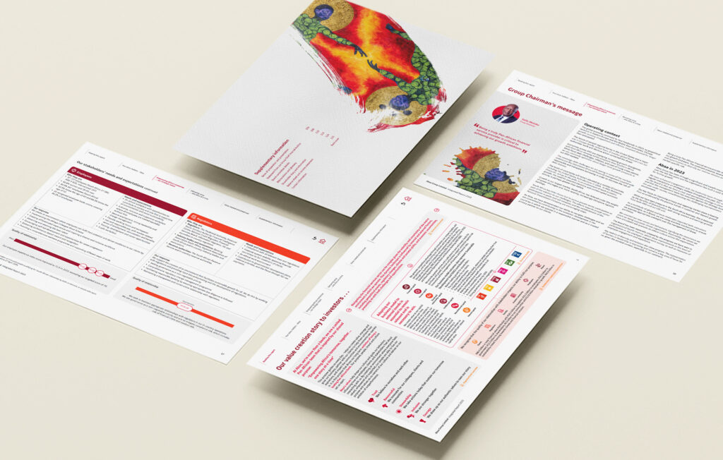
The rise of visual storytelling
A key turning point in integrated reporting design has been the adoption of visual storytelling techniques. Companies now leverage data visualisation, infographics, and illustrations to present complex information in a digestible and engaging way. This trend aligns with the broader movement towards digital transformation, in which audiences expect information to be interactive, dynamic, and visually appealing.
Key design innovations in integrated reporting:
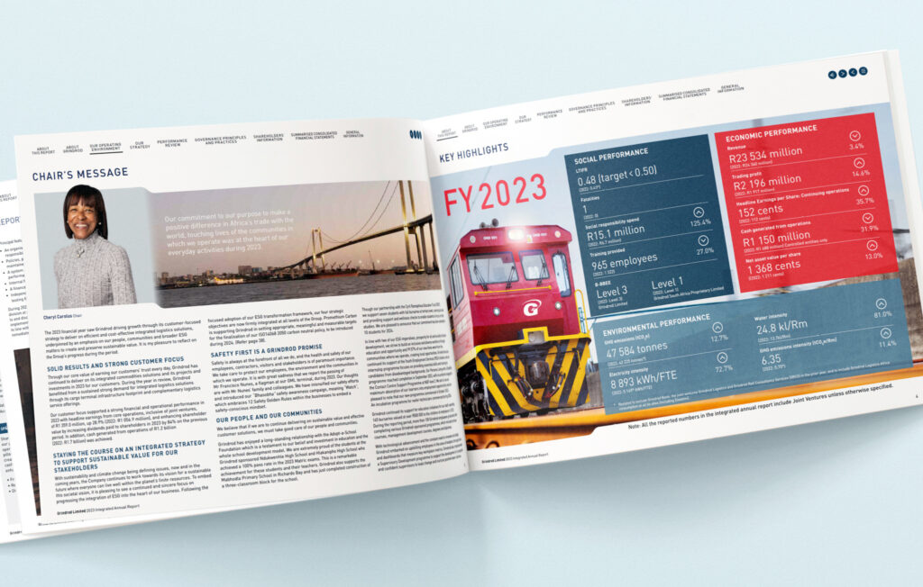
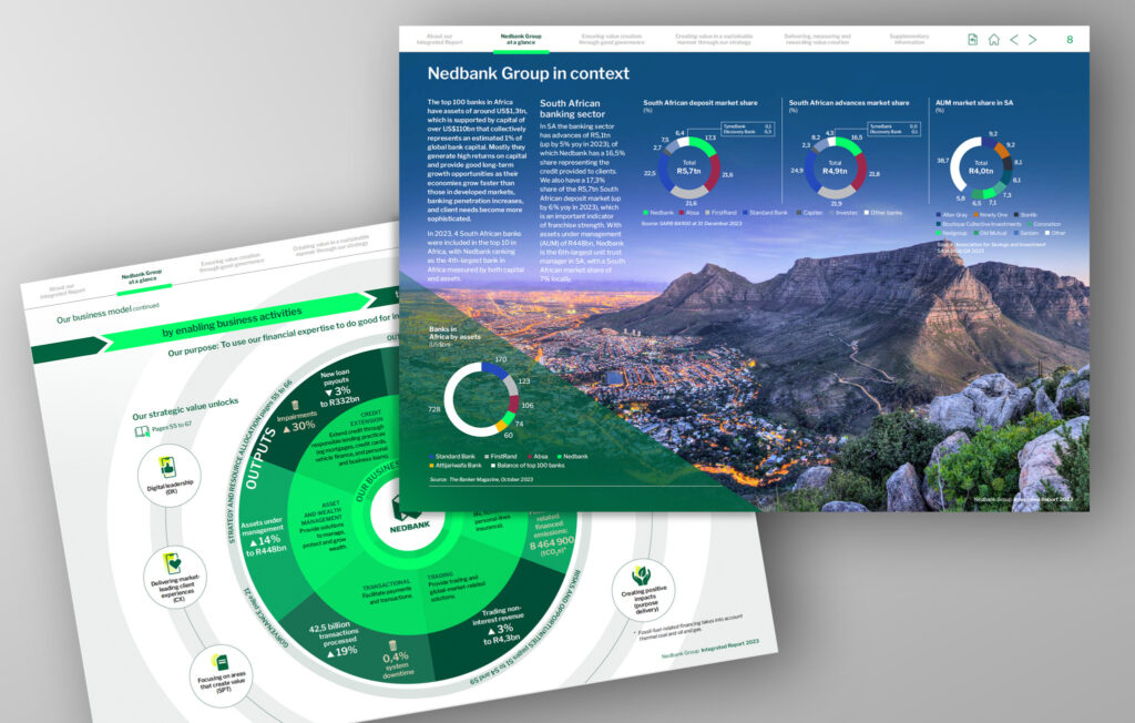
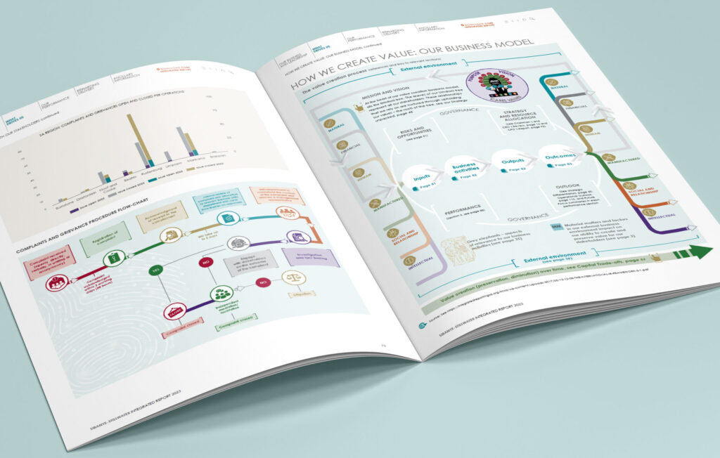
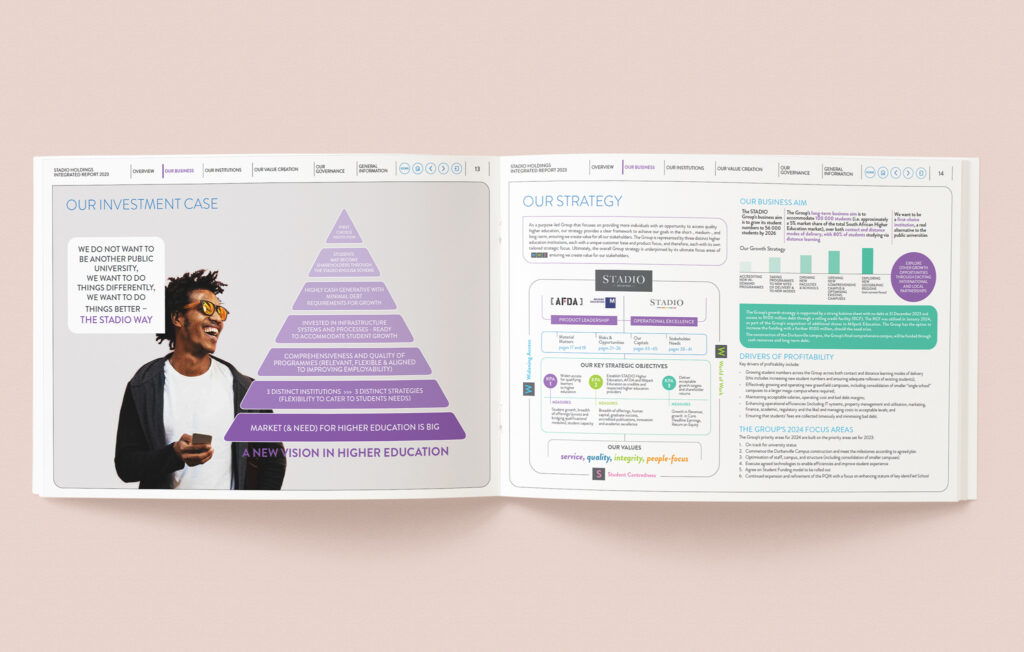
- Data visualisation – the use of diagrams, graphs, and infographics to simplify complex data and trends. Data visualisation enhances comprehension by translating raw numbers and information into visually intuitive formats, making it easier for stakeholders to understand patterns and insights. Interactive dashboards and animated infographics further improve engagement, allowing users to explore key metrics dynamically.
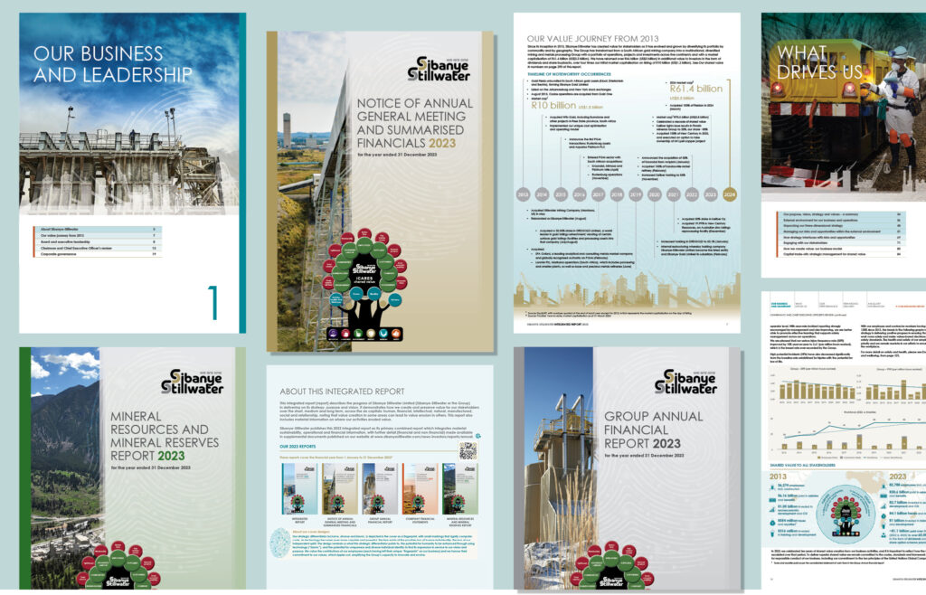
- Consistent branding – reports that reflect an organisation’s visual identity to reinforce credibility and professionalism. Consistency in branding ensures coherence across all communication materials. Elements such as colour schemes, typography, logo placement and image styles should align with corporate identity guidelines to establish familiarity and strengthen trust among stakeholders.
- Minimalist layouts – clean, structured designs that enhance readability and focus on key messages. A minimalist approach eliminates visual clutter, prioritising whitespace, clear hierarchy and concise content presentation. This design philosophy improves user experience by directing attention to critical insights and ensuring ease of navigation across different sections of the report.
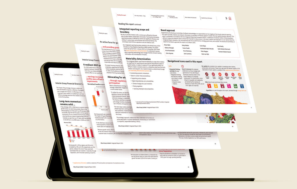
- Interactive digital reports – moving beyond static PDFs to interactive, web-based formats that offer enhanced user experience. Digital-first reports incorporate features such as hyperlinks, multimedia elements and responsive design, allowing users to interact with content seamlessly. Companies can leverage microsites, embedded videos and audio to tailor reporting experiences for diverse audiences. A key turning point in integrated reporting design has been the adoption of visual storytelling techniques. Companies now leverage data visualisation, infographics and illustrations to present complex information in a digestible and engaging way. This trend aligns with the broader movement towards digital transformation where audiences expect information to be interactive, dynamic and visually appealing.
The impact of digital transformation
The digitalisation of integrated reporting has opened new avenues for innovation. Companies are increasingly moving away from traditional print formats and embracing digital platforms that offer:
- Interactive navigation – reports with clickable elements, videos, and embedded links for seamless exploration.
- Customised user experiences – personalised dashboards that allow stakeholders to access the most relevant information.
- Enhanced accessibility – mobile-friendly and accessible designs that cater to diverse audiences.
This shift has not only improved engagement but also aligned with sustainability goals by reducing the need for printed reports.
The role of user experience (UX) in report design
User experience (UX) plays a crucial role in the effectiveness of integrated reporting for both printed and digital integrated reports. A well-designed report ensures ease of navigation, readability and engagement, enabling stakeholders to quickly find and absorb key information.
Key UX considerations in integrated reporting:
- Intuitive navigation – reports should be structured logically, with clear headings, subheadings and clickable elements in digital formats to guide users seamlessly.
- Readability and accessibility – the use of legible fonts, adequate contrast, and inclusive design principles ensures reports cater to all readers.
- Consistent layout – maintaining a uniform structure throughout the report reduces cognitive load and improves comprehension.
By prioritising UX in integrated report design, companies can ensure that their reports not only inform but also engage stakeholders effectively.
The influence of regulatory trends on design
As integrated reporting continues to evolve, regulatory trends have a direct impact on design considerations. Global frameworks such as the IFRS Sustainability Disclosure Standards and the European Union’s Corporate Sustainability Reporting Directive (CSRD) are driving the need for more structured and transparent disclosures.
Key regulatory impacts on design:
- Standardised presentation – new regulations encourage consistency in report formats, requiring clear linkages between financial and non-financial performance.
- Greater emphasis on materiality – reports must highlight material ESG factors, leading to more focused and structured content layouts.
- Digital reporting requirements – regulators are increasingly advocating for digital-first reports that enhance accessibility and comparability across industries.
By aligning with regulatory expectations, organisations can ensure their integrated reports remain relevant, compliant, and user-friendly.
Design as a driver of integrated thinking
Design has become a central component of integrated reporting, transforming it from a static compliance document into a powerful communication tool. As businesses continue to embrace digital innovations and stakeholder engagement strategies, the role of design will only grow in significance. By integrating design thinking into the reporting process companies can ensure that their reports are not only compliant but also engaging, compelling, insightful and impactful.
As Steve Jobs famously said, “Good design is not just what it looks like and feels like. Good design is how it works.” This sentiment perfectly encapsulates the essence of integrated reporting – where design is not merely decorative wallpaper but a critical driver of clarity, engagement and understanding.
 42 Wierda Road West,


